
Niche had a real idea: a place to find your people through shared interests but the product wasn't delivering on it. Engagement was low, retention was worse, and users who signed up once rarely came back. With funding secured and board members watching for signs of product-market fit, the pressure to show real traction was growing.
I joined as Senior Product Designer to help figure out why users weren't sticking and to push for the kind of changes that would actually fix it, not just patch it.
I came in as the sole product designer embedded in the NYC office, working closely with an engineering team while our CEO ran the product vision remotely from California. From day one, I was the design decision-maker on the ground and fielding interaction questions from engineers, filling in edge cases, and moving quickly on decisions that couldn't wait for a founder's calendar.
But my role grew beyond execution. I evaluated the full product experience early on: how it looked, how it felt, and where it lost people. It was clear the foundation wasn't working, and adding features on top of it wasn't going to demonstrate the kind of user value the board needed to see.
I pushed for a deeper rethink. I worked alongside the engineering team as a true partner by explaining design decisions, inviting their input, and incorporating their technical perspective into solutions. I presented directly to the CEO, defended decisions under critique, and stayed open to challenge without losing confidence in my direction.
This was high-ownership, high-trust work in a small team under real pressure.
The business stakes
Niche had funding but the next raise depended on demonstrating growth. Board members needed to see that users weren't just signing up but that they were coming back. Retention wasn't just a UX metric. It was the metric that would determine whether the product had a future.
What I observed
When I first evaluated Niche it functioned like a post-based social app where users could share content, but real conversation rarely followed. I brought in people outside the company to interact with it and watched closely. They understood the concept and thought it sounded interesting. But none of them returned after onboarding because they'd been dropped into clubs that had nothing to do with their actual interests, with no clear reason to stay or come back.
The visual design felt dated too. For an app trying to attract a younger, community-driven audience, the experience wasn't delightful or fresh and that gap in perceived quality was eroding trust before users even got to the core product.
My initial observations raised more questions than they answered so I went deeper by talking directly with users and spending time inside the app's own Feedback Club, where people were already sharing their thoughts unprompted in real time.
As a startup moving fast, I prioritized directional insights over formal research processes, getting real signal quickly from the people closest to the product was the right call at this stage.

1:1 User Interviews
I talked with a range of users — friends who'd tried the app, coworkers who were active members, and a few who had dropped off. These informal conversations surfaced what the data couldn't: how people actually felt about the experience.

In-App Feedback Club
I spent time in the built-in “Feedback Club,” where users freely shared thoughts as they used the app. From small annoyances to big ideas, their unfiltered feedback gave me exactly the signal I needed to make the case for a bigger change.
Discoverability
Users had trouble finding relevant clubs and felt the app didn’t effectively surface communities aligned with their interests.
Participation Hesitancy
Many users didn’t feel confident starting a new club and weren’t sure how active the existing ones were, leading to hesitation and low engagement.
App Perception
Several users described Niche as “just another social app,” comparing it to Instagram which proved a need for stronger differentiation through branding and UX.
The bigger picture
When Threads launched and the conversation about social media fatigue peaked, influencers, journalists and everyday users were all saying the same thing—it confirmed what I'd already been arguing internally. People weren't looking for another feed. They were exhausted by passive scrolling. They wanted genuine connection and conversation.
The problem wasn't a missing feature. It was that the entire model was built for broadcasting when users were craving belonging. And until we fixed that, no amount of new features would move the retention numbers the board needed to see.
I made the case directly, persistently and with user observations and side-by-side flow comparisons showing that we needed to move away from a post-first model and toward something built around real conversation and community. The CEO had designed the original version and a full pivot felt risky to him. Through regular working sessions and honest dialogue about what we were seeing, we aligned on pursuing a meaningful redesign rather than another round of incremental fixes.

Before committing to a full redesign, we took a more cautious first step. The CEO was understandably hesitant and a complete overhaul meant engineering time, risk, and disruption to a product that was already live. So we tried something smaller: adding chat functionality directly into the existing app structure, hoping that introducing conversation features would be enough to spark engagement on its own. It wasn't.
I watched users still struggle to find clubs that felt relevant to them. The navigation was still confusing. The core experience was still built around posting rather than connecting and dropping a chat feature into that framework didn't change the underlying dynamic. Engagement didn't meaningfully shift. People still weren't coming back.
But I didn't see this as wasted effort. It was exactly the evidence I needed. Seeing a targeted intervention fail to move the needle made it undeniable that the problem ran deeper than any single feature could fix. I brought that data back to the CEO with a clear position: we'd tried the conservative path, and it wasn't enough. That made the case for a fuller redesign much harder to argue against and it meant when we did commit to going bigger, we did it on the strength of evidence rather than instinct.

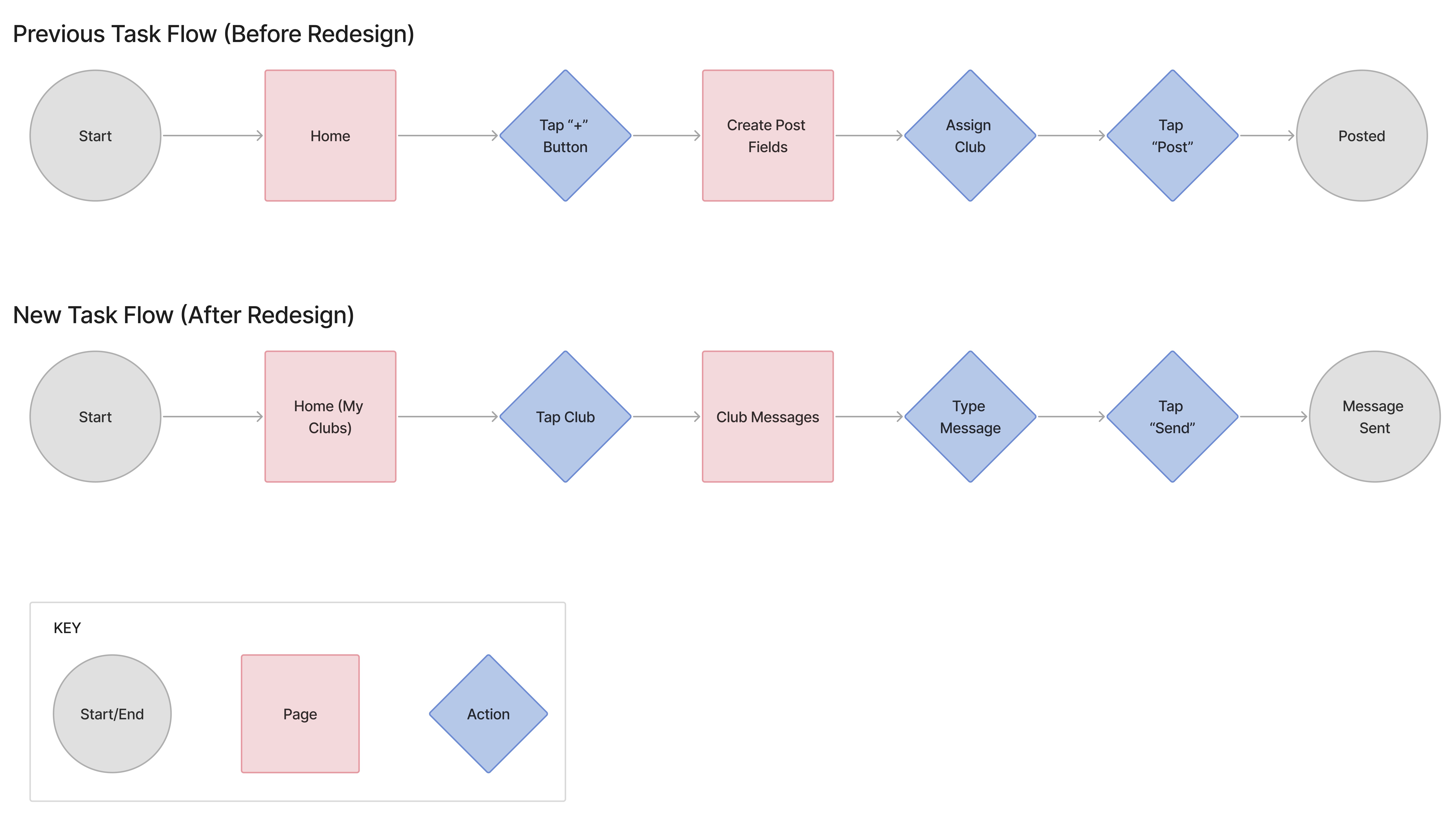
It became clear the problem wasn't the features but was the entire structure. Here's how the flow changed.
From insight to direction
With alignment on the need for a deeper redesign, I moved into shaping what that would actually look like and worked across brand, UX, and interaction design simultaneously, which is how early-stage product work tends to go.
Brand direction first
The visual identity needed to evolve before the UX could. I developed color schemes and brand explorations, presenting options that showed how Niche could feel more current, inviting, and aligned with a community-first product rather than another generic social app. Getting the CEO's buy-in on visual direction early meant the UX work that followed had a consistent foundation to build on.
Restructuring the experience.
I mapped the existing user flows and identified where the model was breaking down which was particularly around onboarding, club discovery, and the transition from passive browsing to active participation. I created wireframes to explore how a conversation-first structure could replace the post-based model, focusing on reducing the steps between opening the app and being inside a relevant, active conversation.


Interaction documentation for engineering
Working async with a small engineering team meant my handoff needed to be precise. I documented interaction behaviors, edge cases, and component states in Figma to make sure engineers had the detail they needed to build without ambiguity, and flagging constraints they raised early enough to design around them rather than patch after the fact.
Iteration under critique
I presented concepts directly to the CEO throughout the process, using his design background as an asset rather than a blocker. I welcomed the challenge. It pushed the work further and built the trust needed to get bold decisions approved.
What started as a feed of scattered posts became a network of clubs built around real conversation. Every screen was designed around one principle: make it effortless to find your people and start talking.


We didn't have the luxury of extensive structured testing. The team was moving fast and the priority was getting the redesign live. What we had was user behavior, direct feedback, and our eyes.
Before the redesign the pattern was consistent. New users onboarded, got dropped into irrelevant clubs, and disappeared. The app felt static. There was nowhere obvious to go and nothing pulling people into conversation.
After the redesign centered around Clubs and chat something shifted. Users started actually talking. Clubs that had been quiet became active. People shared recipes, hikes, recommendations, asked questions and got real responses back. Passive sign-ups were becoming participants. It wasn't overnight but it was directional.
The usability testing we ran (five users with interactive prototypes) confirmed that the new navigation and discovery model made sense in a way the previous version hadn't. Users found relevant clubs. They understood how to engage. The confusion that had defined the earlier experience was largely gone.
The redesign gave Niche users a reason to come back and that was exactly the signal the product needed to make its case.
(Niche was ultimately shut down following a strategic disagreement between the founders about the product's future direction. The redesign didn't get the full runway it deserved but the shift in engagement we observed during that time was real and the foundation we built was sound.)
This project shaped how I think about what it means to be a designer on a small, fast-moving team under real pressure. It wasn't just about the screens.
On advocacy:
I learned that pushing for the right thing even when it's uncomfortable is part of the job. The best thing I did at Niche wasn't a specific design decision. It was making the case, clearly and persistently that small fixes weren't enough. That took confidence I had to build in real time.
On influence without authority:
I wasn't the CEO. I didn't have final say. What I had was research, prototypes, honest conversations, and a willingness to show my thinking rather than just defend my output. Design influence at a startup comes from trust, not title.
On letting go:
Niche shut down before we could see how far the redesign could take it. That was hard because I believed in what we were building. I left with clarity about the kind of designer I want to be: someone who asks the harder questions early, advocates for users even when it slows things down, and finds meaning in the work regardless of whether the company survives it.
Don't be shy! Say hello and we'll get in touch.
irinisarlis@gmail.com