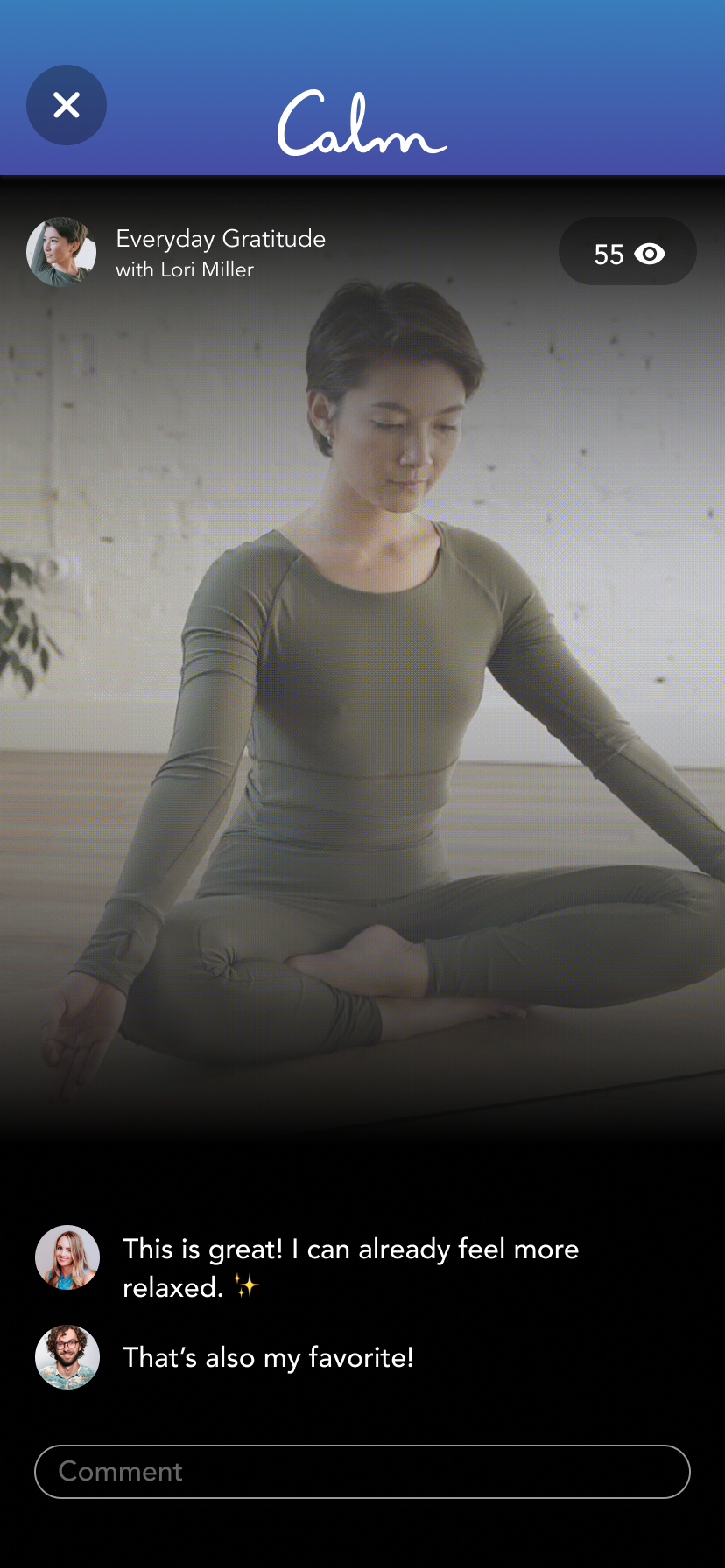
I’m a longtime Calm user—and while the app excels at guiding users to peaceful moments, I often found the experience feeling fragmented and harder to navigate than it needed to be. Motivated by my own recurring frustrations, I initiated this passion redesign as a standalone exploration: diagnosing usability pain points, ideating streamlined flows, and crafting visual enhancements—all without formal involvement from Calm.
This project allowed me to explore how thoughtful navigation and hierarchy could make discovering and using Calm feel more intuitive and calming in every moment.
As the sole designer and researcher behind this exploration, I treated it as if it were a real client brief: conducting user feedback (drawing from my own experience and others’ sentiments), mapping user journeys, ideating solutions, and refining high-fidelity visuals. My focus was on clarity, empathy, and designing with users—not just for them.
I love Calm’s mission to “Find Your Calm,” but as a frequent user I often felt the opposite. Essential tools like mood tracking, journaling, and sleep stories were buried under a vague “More” tab, while the meditation library presented so much content at once that it felt overwhelming. The experience left me unsure where to begin. Presented with so much content at once that it felt overwhelming. The experience left me unsure where to begin.
To validate whether my frustrations with Calm extended to other users, I conducted short interviews and surveys with active meditators. The goal was to understand their meditation habits, goals, and the role Calm played in their routines.
67%
were not meditation beginners — showing Calm serves a more experienced audience than expected.
50%
said they use Calm specifically for anxiety — making quick access to goal-based content essential.
Half
typically meditate for 10 minutes — highlighting the need for easy, time-based filters.
67%
also attend therapy — positioning Calm as part of a broader mental health toolkit.
50%
meditate with others — suggesting demand for features that enable shared or community practice.
I synthesized survey and interview feedback through affinity mapping, which revealed that Calm’s challenge wasn’t a lack of content but how that content was organized and surfaced to users.

Overwhelm in Discovery
Too much choice leads to decision fatigue
Hidden Tools
Key features go unnoticed when buried under “More”
Goal-driven Needs
Users seek fast paths to meditations by goal
Desire for Support
Community and accountability increase engagement
I analyzed leading meditation apps — including Headspace, Insight Timer, Aura, and Breethe — to understand how they organize content and support user needs.

Simplified
Headspace reduces decision fatigue by surfacing a daily recommendation and curated “packs” on the home screen.
Community
Insight Timer builds accountability through live group meditations, communities, and visibility into what friends are practicing.
Personalized
Aura adapts recommendations based on mood check-ins and includes coaching sessions for guided support.
Goal-Oriented
Breethe highlights playlists and goal-driven flows, framing meditation as part of a broader “life kit.”
These patterns revealed opportunities for Calm to introduce clearer pathways, stronger personalization, and features that support community and accountability.
Calm offers an incredible library of tools for meditation and mental health, but the way they’re organized creates friction. The meditation library feels crowded and overwhelming, while essential features like journaling, gratitude, and mood tracking are buried. Even experienced meditators are left unsure where to begin, making the app feel more cluttered than calming.
How might we reduce overwhelm and create clearer, more supportive entry points into Calm’s practices?
Primary Goal
Simplify discovery through clearer categories and filters, helping users find the right meditation faster and with less overwhelm.
Secondary Goal
Provide a dedicated space for non-meditation tools (Self), giving mood tracking, journaling, and gratitude a clear home.
Exploratory Goal
Prototype a community-driven feature (Meditate Together) to explore how light social accountability might strengthen engagement.
Guided by user insights and competitive analysis, I explored three key opportunities to make Calm feel more intuitive and supportive. The solutions focused on simplifying how users discover meditations, giving hidden wellness tools a clear and accessible home, and experimenting with ways to bring community and accountability into the experience.

Early sketches and wireframes exploring how Calm’s features could be reorganized — testing ideas for filters, group meditation, and a dedicated Self section before moving into high-fidelity design.
Users often felt overwhelmed by Calm’s crowded meditation library. To reduce decision fatigue, I introduced filters (e.g., time, goal, experience level) and reorganized sessions into clear categories. This structure gives users faster, more confident pathways to the right meditation, without having to scroll endlessly.


Important features like journaling, gratitude, and mood tracking were hidden under the vague “More” tab, making them difficult to access. I created a new Self section — a dedicated space for mental health practices beyond meditation. This made Calm’s broader wellness tools visible, intuitive, and supportive of users’ day-to-day self-care.
Half of surveyed participants said they sometimes meditate with others. To explore this behavior, I prototyped Meditate Together, a lightweight community feature that lets users join live group sessions or see when friends are meditating. This encourages accountability and makes meditation feel less solitary, while staying true to Calm’s supportive mission.

This project reimagined Calm’s navigation and structure through the lens of user needs. By reducing overwhelm, surfacing hidden self-care tools, and exploring light-touch community features, the redesign demonstrated how small shifts could make the app feel more intuitive and supportive. As a passion project, it wasn’t implemented, but it offered valuable lessons in designing for clarity and calm.


Phase 1 went through user testing and the results were
Don't be shy! Say hello and we'll get in touch.
irinisarlis@gmail.com