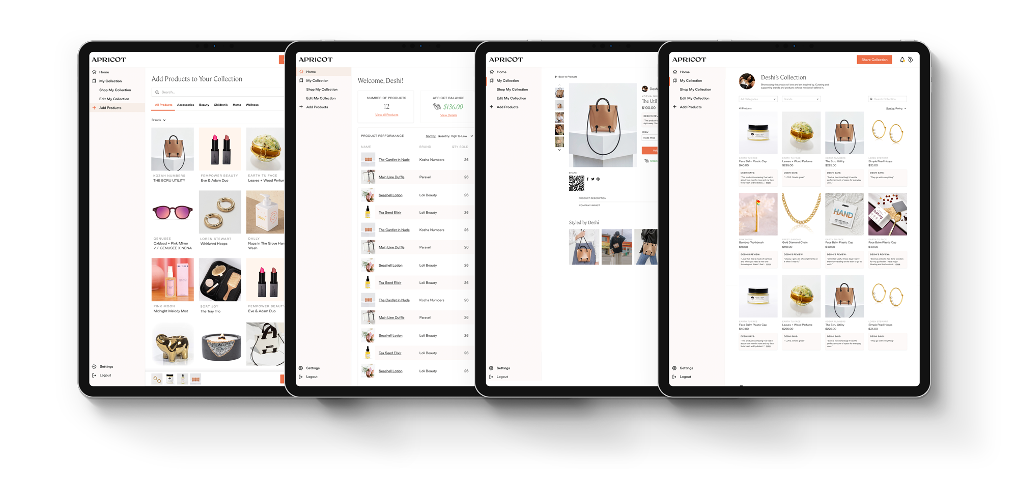
When I joined Apricot, what drew me in was its mission: helping women—whether stay-at-home moms, side hustlers, or anyone looking for extra income—create a revenue stream by doing something familiar: shopping and sharing products. The CEO herself, a mother who understood these challenges firsthand, founded Apricot to empower women.
As the sole product designer, I led the redesign across discovery, UX, and UI—mapping the fragmented buyer–seller journey, addressing onboarding friction, and unifying the shopping and seller experiences. I worked side by side with the Product Manager to balance user needs with business goals, collaborated with engineering on feasibility, and partnered with the CEO to align on long-term strategy. This project spanned Phase 1 (integrating a way to access your Collection) and Phase 2 (introducing shopping into the Portal), laying the groundwork for a unified marketplace.
To better understand my design decisions, it helps to see how Apricot works today. At its core, Apricot lets users create curated product Collections, share them with friends, and earn cash back from every purchase—whether their own or others’. This referral-first model blends social shopping with tangible rewards, driving engagement while supporting platform growth.

When I joined Apricot as the sole product designer, I dove into the platform. I wanted to understand the product from a fresh perspective. I walked through the onboarding process as a new user, identifying friction points and confusing flows. Using Hotjar, I tracked exactly where users were dropping off. I also met with the PM to discuss her findings — which included insights from a couple of recent user interviews — and spoke with engineers to learn about technical constraints that might be shaping the experience. These conversations revealed a clear pattern: despite a promising concept, users faced unnecessary barriers early on, and core product areas felt disconnected. These early observations shaped my first design initiatives: streamlining onboarding, improving navigation, and laying the groundwork for a more cohesive, trustworthy platform.
Through early product analysis, I identified three core UX problems that were holding Apricot back—each one creating a ripple effect. The first blocked new users before they could experience value, the second confused those who stayed, and the third reduced overall trust in the platform. Addressing these issues became the foundation for improving retention, streamlining the seller experience, and setting the stage for future growth.
How might we unify Apricot’s user experience and onboarding flow so new users understand the value of Collections and feel confident shopping and sharing products?
While addressing these challenges, I also needed to refresh Apricot’s brand visuals for consistency and create a scalable component library to support future growth.
Challenge
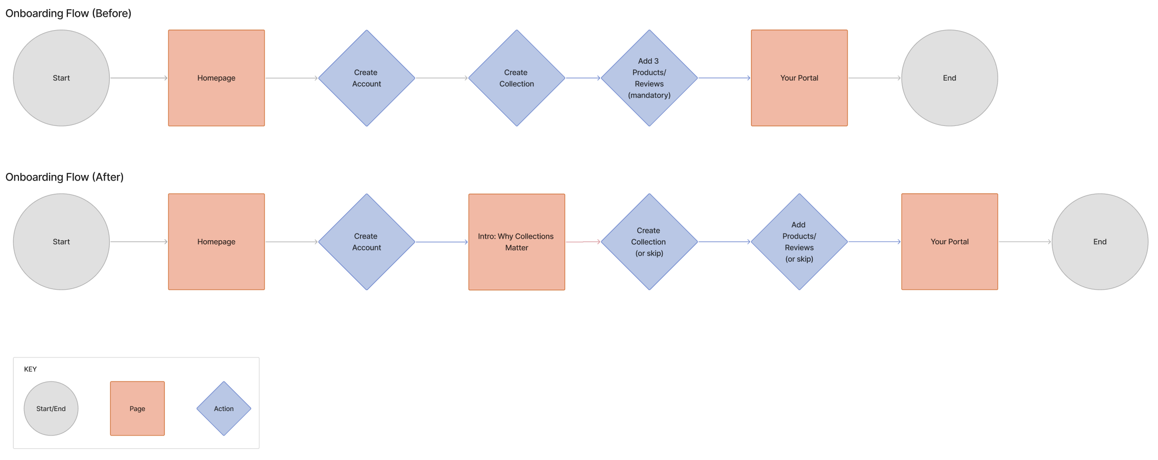
New sellers were immediately asked to create a Collection, add at least three products (often ones they hadn’t purchased), and write mandatory reviews before they could explore the platform. This high-friction start caused drop-offs and inauthentic engagement.
Solution
Redesigned onboarding to explain the value of a Collection first, made product addition optional, and removed mandatory reviews. This let users start small, contribute authentically over time, and reach their Portal faster without pressure.
Challenge
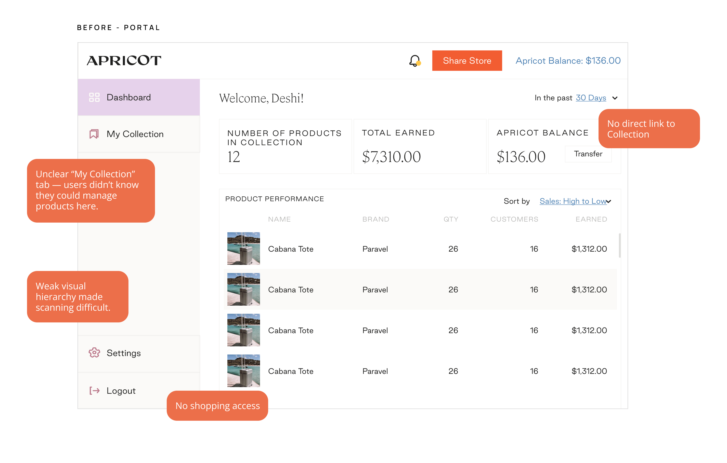
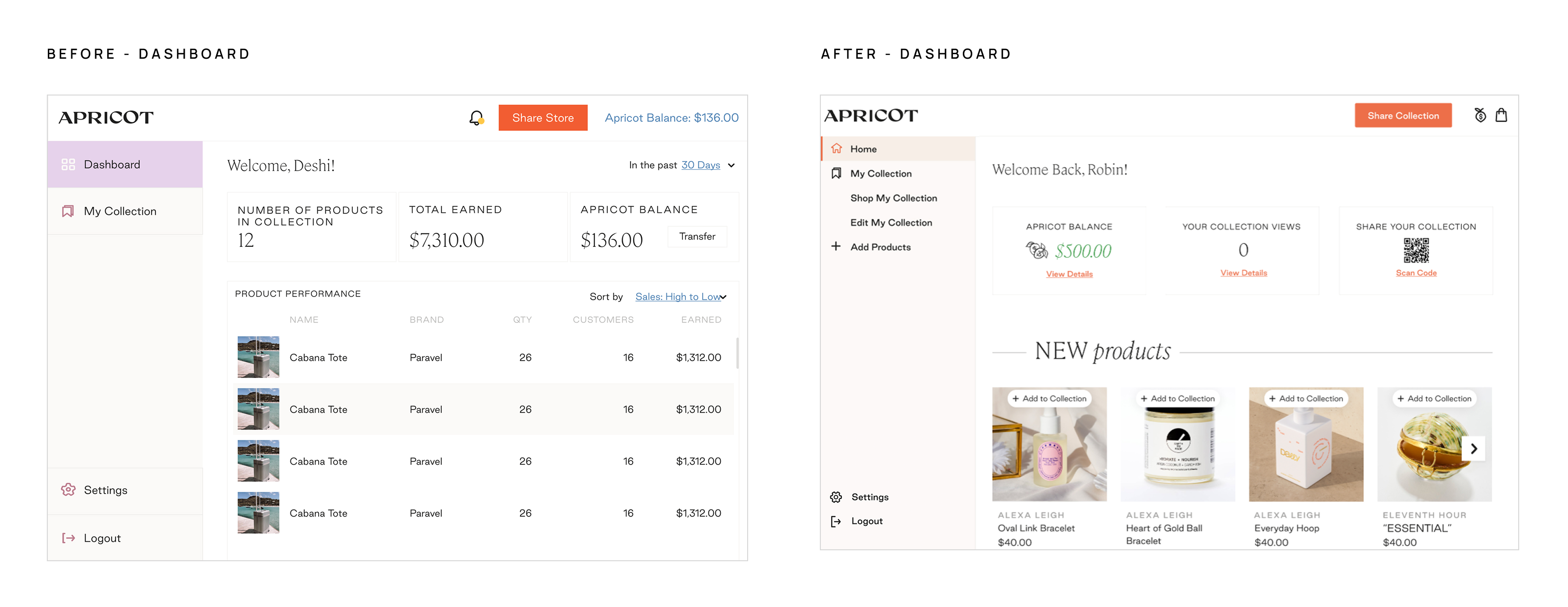
The Portal (product management + earnings tracking) and the Collection (public storefront) were completely separate. Users couldn’t easily connect managing products with seeing their Collection, making navigation confusing and the revenue connection unclear.
Solution
To bridge this gap, I tackled the problem in two phases.
Phase 1: Adding Collection link to the sidebar
Phase 2: Making the Portal shoppable
Added a sidebar link that opened the user’s Collection in a new tab, with “Edit Collection” guiding them back to the Portal — a first step in connecting the two experiences.

I expanded the experience by enabling shopping directly within the Portal. Users could browse products across the site, hover to add items to their Collection or cart, and move seamlessly between managing and shopping. This made the Portal an intuitive entry point for both curation and commerce, reinforcing Collections as a key revenue driver.

Challenge
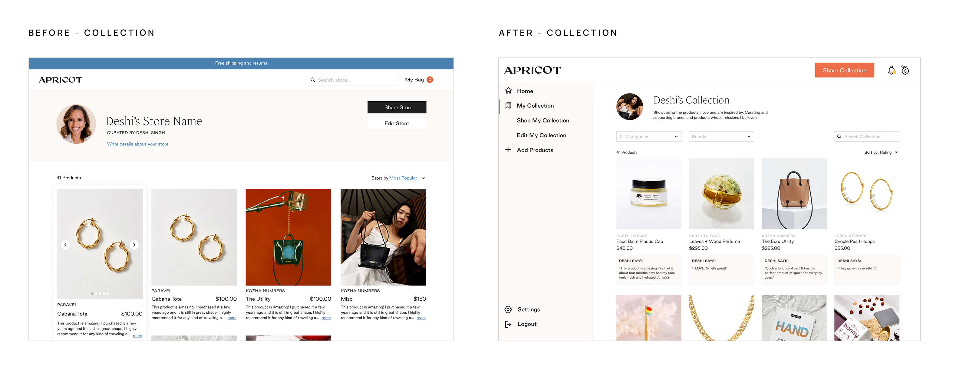
Typography, colors, and visual hierarchy were inconsistent, making the platform feel unpolished and reducing trust. These visual gaps made the experience feel disjointed and harder for users to navigate confidently.
Solution
Introduced a unified color palette, consistent typography, and improved hierarchy—creating a cohesive, trustworthy look and feel. Built a scalable component library to ensure consistency, speed up design work, and support future product growth.

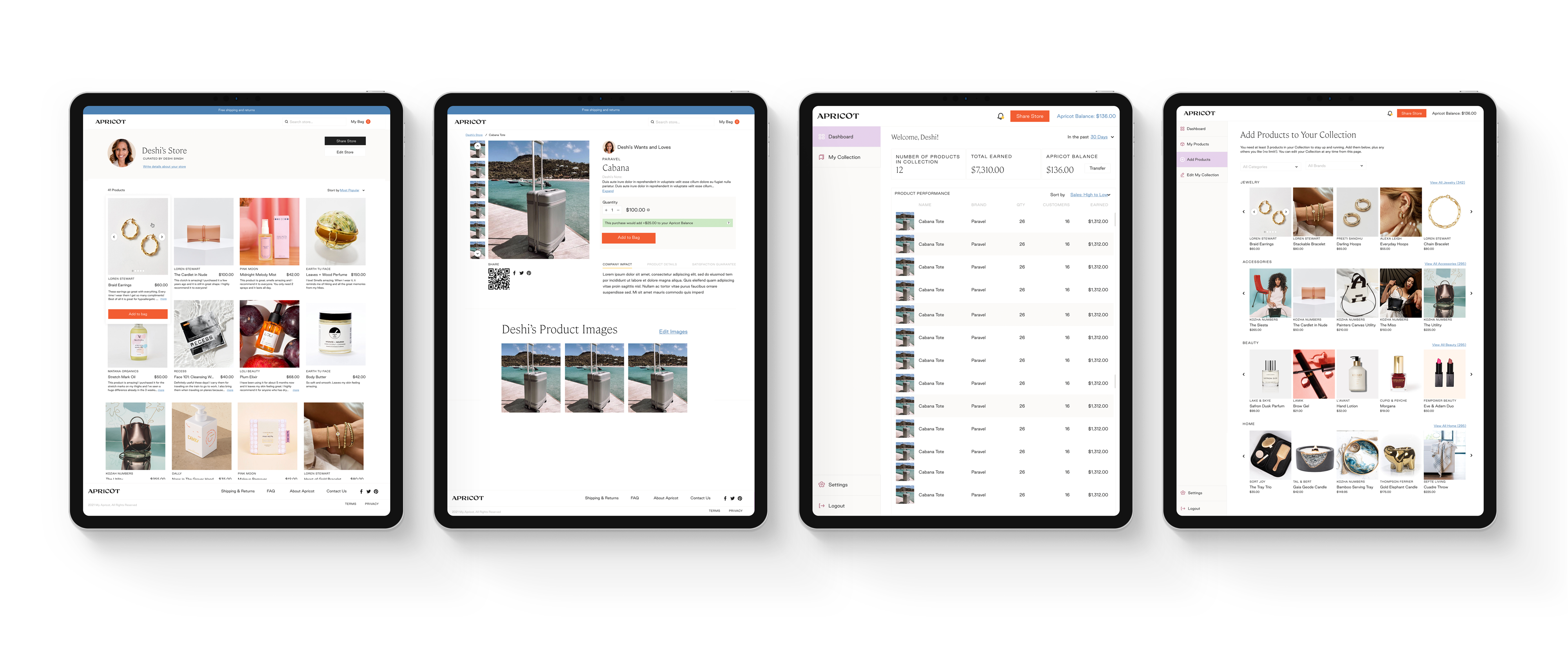
I applied the new UI and style guide across key pages — lowering the saturation of the Apricot brand color, introducing a softer canvas background, and increasing whitespace for a cleaner feel. These changes improved scanability, reduced visual noise, and created a more cohesive look across the entire platform.
Below shows the previous designs vs the updated ones.
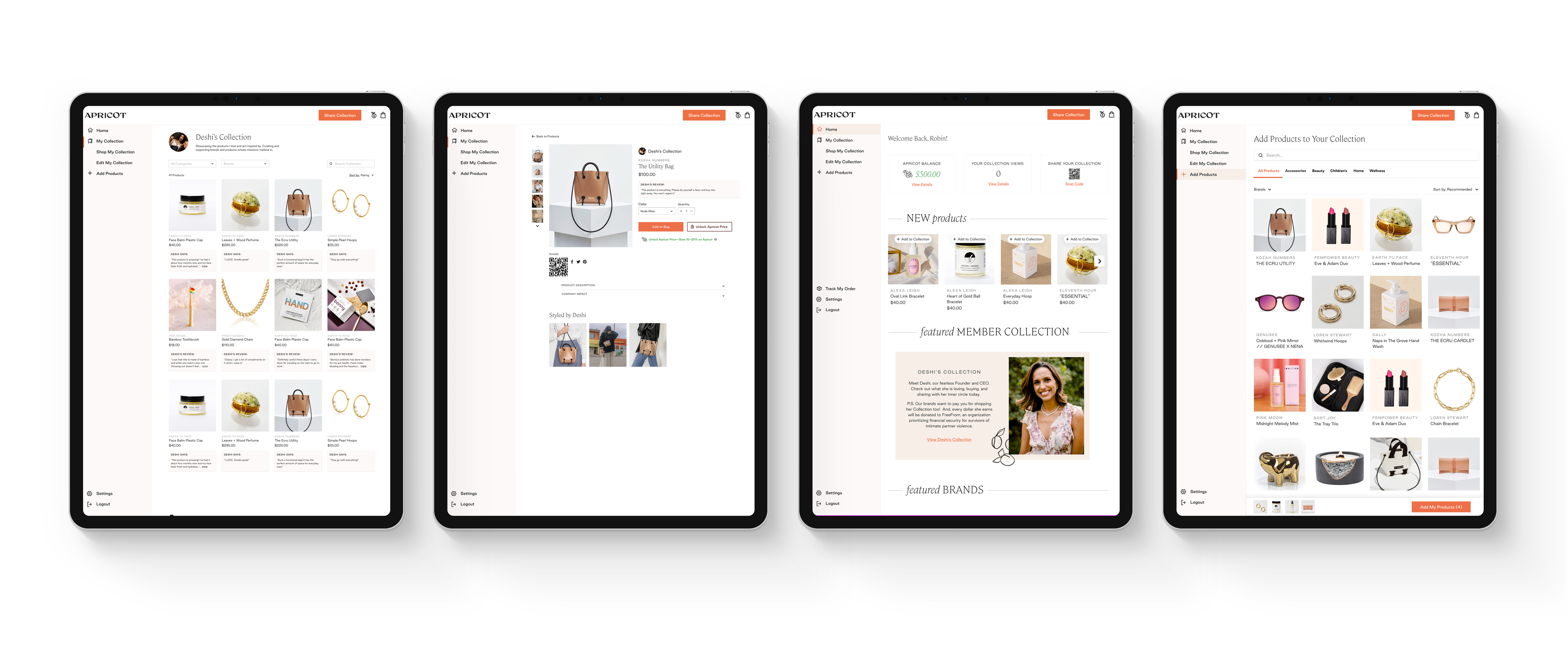


This work marked Phases 1 and 2 of Apricot’s redesign—removing onboarding friction, unifying navigation, and surfacing shoppable products directly within the Portal. These foundational changes made the experience clearer, more cohesive, and set the stage for a scalable design system. Together, they showed how small pivots can build clarity and trust while laying the groundwork for a larger marketplace vision.


Phase 1 went through user testing and the results were
Don't be shy! Say hello and we'll get in touch.
irinisarlis@gmail.com